


Google Slides
4.322.97K Reviews
App Specs
- Version
- Varies with Device
- Updated On
- License
- Free
- Downloads
- 1,000,000,000+
- Developer
- Google LLC
- Categories
- Productivity
- Platform
- Android, iOS
Screenshots
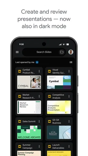
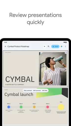
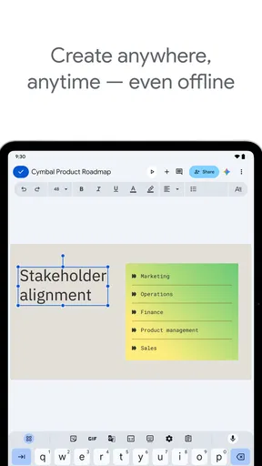
 Analysis by AppCompare
I’ve found that most frustration with a presentation app starts before the first slide: a file opens in the wrong account, a change seems not to stick, or a phone screen makes a layout look different from the one I remember on a laptop. Those are the moments when I judge a tool less by its feature list and more by whether I can get back to work without a fuss. Google Slides is useful in those situations, though it helps to know what the mobile app is best suited to do—and when I’d rather switch to a larger screen.
Where a presentation workflow can snag
On a phone, I treat slide editing as a focused task rather than a full desktop session. It’s handy for correcting a title, replacing a picture, reordering a few slides, or adding notes while an idea is fresh. Detailed layout work is less comfortable: the small canvas and touch controls make precise spacing harder to judge, and a quick adjustment can take longer than it would with a mouse and a full display.
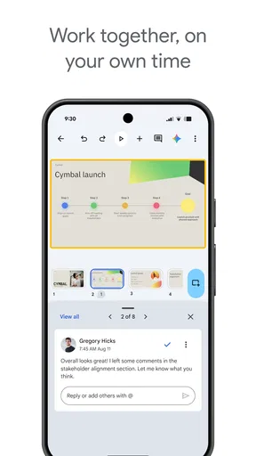
Collaboration is a strength, but it can also create a little uncertainty if several people are editing at once. Before making a large set of changes, I check that I have the intended presentation open and pay attention to what is selected. For team work, a simple habit helps: agree who is handling which slides, then review the deck together before presenting. That avoids accidental overlap without turning a shared document into a chain of duplicate files.
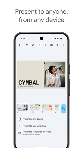
Another common point of friction is expecting a presentation to behave exactly like a finished video. Slides are designed to be edited and presented, so a deck that looks tidy in the editor still deserves a run-through in presentation mode. I check images, text wrapping, and the order of slides before sharing or presenting; it’s a small step that catches issues while there’s still time to fix them.
Setup checks that save time
When I can’t find a deck, I first check which Google account is active and whether I’m looking in the right place. This sounds obvious, but it’s an easy source of confusion when personal and school or work accounts sit side by side. I also confirm that I opened the intended copy rather than an older file with a similar name. A clear filename and a sensible folder in Drive make later searches much less of a guessing game.
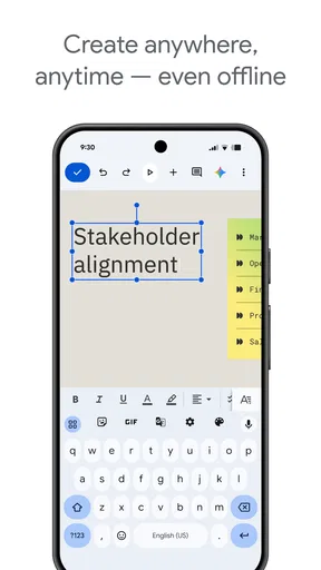
If I’m going to work without a dependable connection, I plan ahead instead of assuming every file will be ready offline. I open the presentation while I’m connected, check that the content I need is available, and avoid leaving important edits until the moment I lose signal. For a trip or a meeting in a place with unreliable internet, I also keep a separate way to reach the material I need. That is not a substitute for checking the deck, but it reduces the chance that one connection problem stops the whole task.
For a new project, I like to decide on the audience and purpose before choosing a template. A class presentation, a short project update, and a photo-led talk need different pacing. Starting with a template can save time, but I still remove layouts and decorative elements I don’t need. A consistent set of slide styles usually looks more deliberate than a deck where every page has been customized in a different direction.
Worth Reading Before You Choose

Flipboard Shows What News Apps Must Do Beyond the Feed

Switching to Android Auto Means Rethinking Your Driving Routine
Google Calendar Makes a Crowded Week Easier to Manage

Ludo King Makes the Most of the Minutes Between Plans

Baby Panda World Brings Quick Play to Modern Phones, but Its Game Library Feels Busy

ESPN’s Live Game View Makes Following Close Games Easier
Making Google Slides work for real projects
I use this section to focus on the small decisions that make a shared presentation easier to maintain: naming the file clearly, agreeing on slide ownership, and checking the deck as a whole before presenting. Those habits can prevent avoidable confusion when a project moves between people and devices. From there, it’s worth looking at how I recover calmly when an edit or layout doesn’t appear as expected.
Recovering a workflow without making it worse
When something looks wrong, I try to isolate the problem before making more edits. I check whether the issue affects one slide or the whole presentation, whether it appears on another device, and whether the file is the one I meant to open. If a change seems missing, I pause and check the current document before repeating the edit. Re-entering the same text or moving the same object several times can create a bigger cleanup job if the first change was simply slow to appear.
For a layout that has become messy, I find it safer to fix one thing at a time: first the slide’s structure, then the text, then images and finishing touches. That order makes it easier to spot which change helped. If the mobile interface is getting in the way, I save the fine alignment for a tablet or computer and use the phone for the parts it handles comfortably. Switching devices is not a failure; it is often the quickest route to a clean result.
When the problem may be elsewhere
Not every delay or display issue comes from the app itself. A weak connection can interrupt access to cloud-based work, while the wrong account or an outdated copy can make a correct edit appear to have vanished. I check those basics before assuming the presentation is damaged. If the difficulty is limited to one device, comparing the same file elsewhere can help me tell whether I’m dealing with a local display or access problem rather than a flaw in the deck.
I also separate content problems from design problems. If an image is blurry, changing the slide theme will not improve the source image. If a paragraph feels cramped, adding more decoration is unlikely to help; shortening the text or splitting the idea across slides is usually clearer. Google Slides gives me a convenient place to make these changes, but it cannot decide what information the audience needs or make an overloaded slide easy to read.
Features That Make You Go "Wow!"
Let’s talk features. Google Slides packs a punch with its array of tools. From inserting images, videos, and even charts, it covers the basics and then some. One feature I particularly adore is the collaboration aspect. You can literally have your team work on a presentation simultaneously from different corners of the world. It’s a modern marvel, cutting down endless email chains and version confusion.
Another gem is the template gallery. If you’re pressed for time or creativity (we’ve all been there), Google Slides offers a variety of templates to jumpstart your project. Whether it’s for business, education, or personal use, there’s something for everyone.
User Experience: Smooth Sailing or Rocky Waters?
Accessibility? Check. Features? Double check. But how does it actually feel to use Google Slides? In a word: effortless. The interface is intuitive, making it user-friendly for newbies and seasoned presenters alike. The drag-and-drop functionality is a breeze, and navigating through the menu is straightforward.
However, no app is without its quirks. Occasionally, when working offline, the app can be slightly temperamental. But let’s be real, how often are we really offline these days? As long as you have a decent internet connection, you’re golden.
Integrations and More
In today’s digital age, the ability to integrate with other tools is crucial. Google Slides doesn’t disappoint. It plays nicely with other Google Workspace apps, like Docs and Sheets, making it easy to incorporate various elements into your slides. The integration with Google Drive is a lifesaver, ensuring all your work is safely stored and easily shareable.
Moreover, the app supports third-party add-ons to extend its functionality. Whether it's adding custom fonts or embedding interactive content, you can tailor your presentation experience to fit your needs.
Choosing it over other presentation tools
For a person who already keeps working files in Google Drive, I find Slides especially convenient: the deck sits near the material it supports, and collaborators can work in the same shared file instead of passing versions around. That is a practical advantage over workflows built around sending presentation attachments back and forth. If your work already lives in another office suite, though, switching may add friction rather than remove it. I’d choose the tool that fits the team’s existing files and habits, not move everyone simply for a familiar interface.
Compared with a presentation editor designed mainly for elaborate visual effects, Slides feels more like a straightforward place to build, revise, and share a deck. That suits lessons, project updates, meeting agendas, and simple pitches. If a presentation depends on intricate animation, precise brand layouts, or extensive final polishing, I’d do the detailed work on a computer and consider whether a more specialized desktop editor better fits the job. The mobile app is a useful companion, not the right place for every kind of design decision.
A useful everyday routine
Imagine I’m preparing a short update for a team meeting. I can sketch the main points in a deck, use a template to establish a starting look, and ask a colleague to check the figures or wording in the shared presentation. On the way to the meeting, I can review the slide order and correct a typo on my phone. Before presenting, I still do a final pass on a larger screen, where text size and alignment are easier to assess. This division of labor plays to the app’s strengths without pretending that a phone is ideal for every task.
For students, the same approach works well for a group assignment: create one shared deck, give each person a clear section, and leave time to make the transitions between sections consistent. For a solo user, Slides can also hold a simple visual plan for a trip, a club event, or a personal project. I would not use it as a substitute for a spreadsheet when the main job is comparing lots of figures, or as a long-form writing space when the content is mostly paragraphs. Its value is in organizing ideas for an audience, not in being the best tool for every kind of information.
Small habits that improve the result
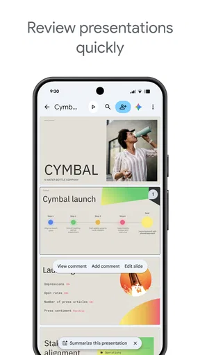
One useful habit is to write slide titles as takeaways rather than broad labels. A title that tells me the point of the slide makes the deck easier to follow, especially when I’m reviewing it quickly on a phone. I also try to keep each slide focused on one idea. If I need to shrink text repeatedly to fit, that is often a sign to simplify or split the content rather than keep squeezing.
When inserting a chart or image, I think about whether it will still make sense to someone who has not seen the source material. A chart without a clear point can distract more than it explains, and an image that looks good on a large screen may be hard to read on a phone. I use the mobile view as a quick legibility check, then inspect the final deck at the size and setting where it will actually be shown. That combination catches different problems than either check alone.
Templates are most helpful when treated as a starting structure, not a finished design. I keep the parts that make the presentation consistent and remove elements that compete with the message. The trade-off is that a template can make a deck look orderly quickly, but a heavily customized look takes more careful editing. For a routine update, speed and clarity usually matter more to me than making every slide distinctive.
Who will get the most from it
I’d recommend Google Slides to people who need to make understandable presentations, share drafts, and revisit them across devices. It is a particularly sensible choice for classmates, small teams, and anyone already using Google Workspace who values a shared working document over a pile of attachments. The free price makes it easy to try for ordinary presentation needs, and its Everyone age rating makes it broadly suitable for general audiences. Google LLC has offered the app since June 25, 2014; its average rating is 4.2 from around 675,000 ratings, with about 23,000 written reviews and over one billion installs. Those figures suggest a widely used tool, but they do not tell me whether it fits a particular team’s workflow.
I’d be more cautious if I needed to produce highly art-directed slides entirely on a phone, or if my organization depends on a different suite and does not want another shared-file workflow. Someone who mainly needs to present existing files may not need a full editor, while a designer who needs exact control over every visual detail may prefer a desktop-first tool. In those cases, Slides can still be useful for reviewing or making a quick correction, but I would not make it the center of the process.
Final Thoughts
Wrapping things up, Google Slides is a powerhouse in the world of presentation apps. Its convenience, rich feature set, and collaborative capabilities make it a top pick for anyone looking to create compelling presentations on the fly. Sure, it has its minor hiccups, but in the grand scheme of things, it’s a tool worth having in your arsenal.
If you haven’t given Google Slides a whirl yet, I’d say it’s about time you did. Whether you’re a student, a business professional, or just someone who loves to create, this app has got you covered. Happy presenting!
Pros
- User-friendly interface for easy navigation.
- Real-time collaboration with multiple users.
- Seamless integration with Google Drive.
- Wide range of templates available for free.
- Accessible on multiple devices and platforms.
Cons
- Limited offline functionality.
- Requires a Google account to use.
- Less feature-rich than PowerPoint.
- Occasional lag with large presentations.
- Limited font options compared to others.
FAQs for Google Slides
What is Google Slides and how can I use it?
Google Slides is a cloud-based presentation app that allows users to create, edit, and collaborate on presentations online. It’s accessible via web browsers and mobile devices on both Android and iOS. Users can start from scratch or choose from various templates, and seamlessly share and collaborate in real-time with others.
Is Google Slides free to use, and are there any limitations?
Google Slides is free to use for anyone with a Google account. While it offers robust features for creating presentations, some advanced features may require a subscription to Google Workspace. The free version includes 15GB of shared storage across Google services, which can be a limitation for users handling large amounts of data.
Can Google Slides be used offline?
Yes, Google Slides can be used offline, but you need to set it up first. By enabling offline access in the settings, you can view, edit, and create presentations without an internet connection. Changes made offline will sync automatically once you reconnect to the internet, ensuring your presentations are always up to date.
How does collaboration work in Google Slides?
Collaboration in Google Slides is seamless and allows multiple users to work on the same presentation simultaneously. You can share your presentation with others via a link or email invitation, assigning different levels of access such as view, comment, or edit. Changes are visible in real-time, and you can communicate through built-in chat and comments.
What types of files can be imported into Google Slides?
Google Slides supports various file types, allowing you to import and convert PowerPoint presentations (PPTX), PDFs, and images into your slides. You can easily drag and drop these files into Google Slides and retain most of the formatting. This flexibility makes transitioning from other presentation software straightforward and hassle-free.


